If you have a LinkedIn profile, you might know that a photo headshot optimizes your chances of being an attraction magnet. When you create your profile, a note pops up stating you’re 21 times more likely to have a recruiter access your profile.
I’ve been recommending that my clients add one or update theirs if more than five years old. You can have someone take the photo with your iPhone or hire professional photographers who charge around $250. If you’re looking for a 6- to 7-figure salary, it’s a small investment.
I took my advice.
In July, I had a professional photographer click away for photos for my LinkedIn profile, the business website www.resumetech.guru, and my book back cover for Clicks, Tricks & Golden Handcuffs. My apologies to the park’s camera surveillance team when I had to get, well, naked in the park for outfit changes. I didn’t quite notice the surveillance cam until I looked up after I had changed out my pants and blouse on that very chilly morning.
The iconic Seattle Art Museum Olympic Sculpture Park was my selected photo location, mere blocks from my condo and part of my daily walking routine. It features my beloved orange Calder sculpture (one of my company’s brand colors) and Teresa Fernandez’s Seattle Cloud Cover outdoor glass bridge and sculpture (also featuring my brand colors plus a subtle nod to cloud computing). The Space Needle appears in the background.
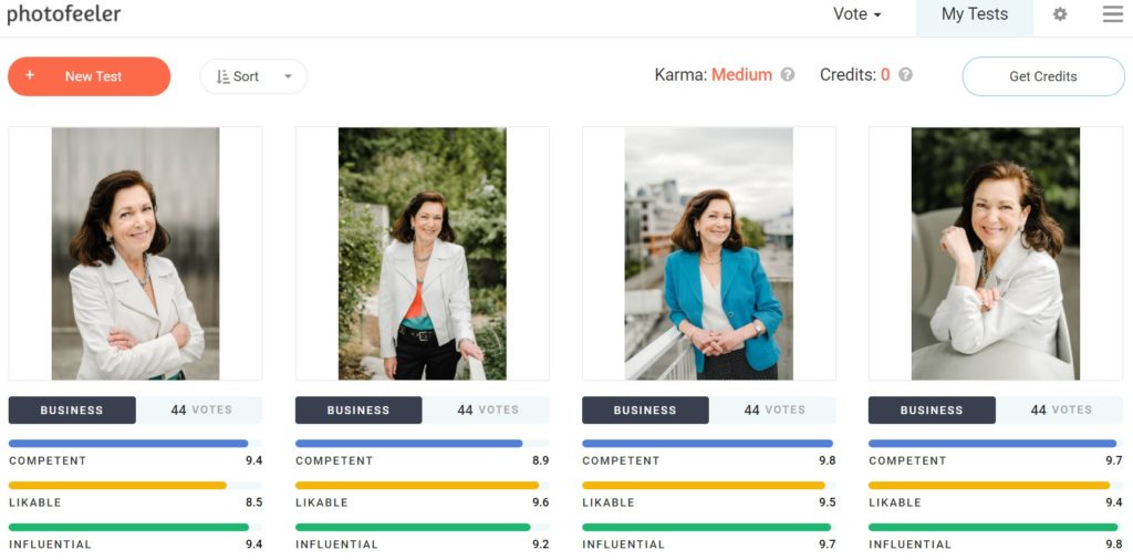
Studies indicate we don’t select our best photos. I found a free app that provides a data science-backed analysis. Suppose you want to know how your LinkedIn photo rates, please head over to www.photofeeler.com and post your photos. In turn, you’ll receive crowdsourced input based upon how competent, likable, and influential you appear in your image. You can select whether it is for business, social, or dating apps.
In August, I selected the top 4 images my professional photographer Sasha sent me and submitted separate test queries to Photofeeler related to my business image. For my testing, I topped off the results after 44 responses. The far-right hand picture ranked the highest on “Influential” with a 9.8 score, while the blue jacket scored highest on “Competent,” coming in at 9.8. Crossing my arms in the first photo resulted in a 1 point drop in “Likable.”

Next, I went to my tech exec clients for feedback on the best one for my book back cover. Their insight ran the gamut from my clothing selection (white vs. blue jacket), smile (trying too hard or relaxed), hands (awkward vs. natural), and location selection (great outdoors vs. professional setting).
Overall feedback from 13 clients is that the #3 photo with the blue jacket won my book back cover.
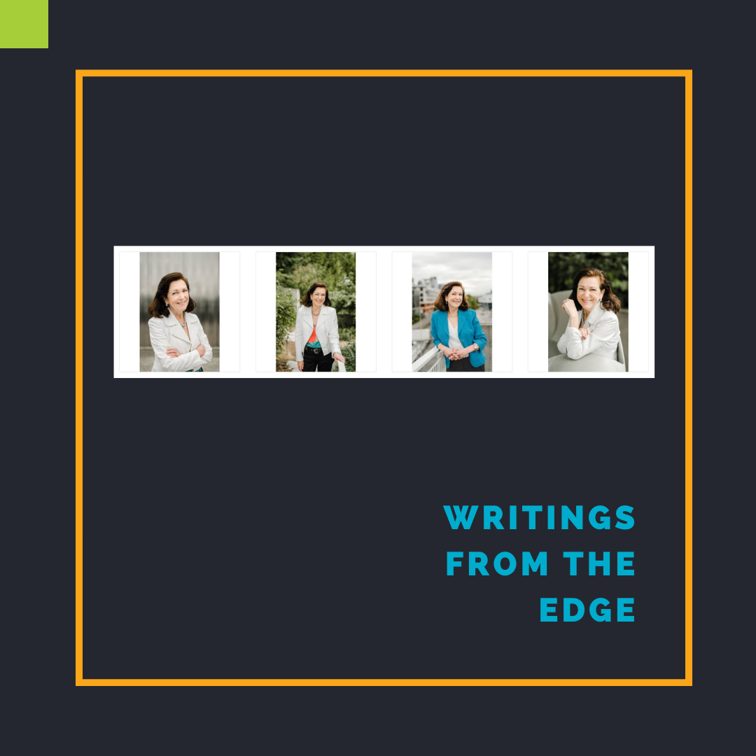
Here’s a selection of my clients’ interesting bits based on the photo array pictured. Would you please notice my male clients insert more smiley faces in their responses? I find that quite amusing.
Male Feedback
- If you are forcing me to choose, the one on blue jacket with city background is the least meaningless and therefore wins. But I would use none of proposed. 😊 Let me explain. All of them have too much smile/charm/borderline flirt. None of them is in a business environment. None of them is elevating my confidence that you will elevate my (business) reputation. They show me that you are a lovely human being but don’t elevate my trust that you know what you are doing. 😊
- 1 or 3 and would zoom closer to your face, too much space dedicated to the background, would also consider blurring the backgrounds more as they are not important. More face, less torso. If forced, would go 1 over 3, but only as white has a stronger subliminal message re women in power.
- I think either #1 or #3. If I had to pick one, I would say #1.
- 3rd from the left.
- 3 😁
- I love all 4 pics… The one that stands out to me the most is the one with the blue coat. Very striking 🙂
- As far as jacket photos, I can’t believe you went for the pun of wearing a jacket for your jacket photos. For shame 🙂 They’re all well-done, authentic shots, but if I were forced to choose, I’d go with #1 (white jacket, arms crossed). It projects confidence from a job well done. #3 (teal jacket, leaning on the rail) is a close second. I think the color will help it pop when shrunk in size.
Female Feedback
- Third I think (blue ). It stands out, exudes executive presence
- You know I like color 🙂 Blue is my favorite
- My stack rank: 3 2 4 1
- These are all wonderful! Any one of them would work well, so there’s simply not a bad choice. That said, I’m drawn to the last one (grey jacket) — I love your big smile and close-up! You could even crop it into a square or circle if that would fit better on your back cover.
- This is hard! By the process of elimination … Though I like the first one, I would say nix the pic with arms crossed. If I need career help I want someone with open arms 🙂 I really like the photo of you on the far right, but the arm position is a bit distracting. I’m like “what is she doing with her arm?”. It may take away from the focus on you. The two remaining in the middle are both good, but I’m leaning toward the blue jacket with the cityscape behind you. Blue is trustworthy and your posture gives a confident, assured vibe. Net net blue is you!
- First, I love the photo with the greenery. There is something energetic and approachable that the others don’t quite capture. I do love the blue jacket too, and that’s more “business” – so that would be great too.
After that flood of client input, I wasn’t entirely “singing in the rain” in Seattle. Since I don’t like to be photographed, the next step was arduous.
I asked Sasha, the photographer, for an additional 20-minute session to capture the brain dropping in my head. We met three weeks ago at the same location, and, of course, it was raining on queue for the typical Seattle month of August. I brought an umbrella and a steadfast belief that I would have Sasha capture my essence of being competent, likable, and influential. Plus, I was praying for a good hair day since it was raining cats and dogs.
I received the updated photos this week. You’ll have to wait until November to see the final selection for the back of the book photo. My brand colors, a cloud, golden handcuff reference, and the true me are featured.
I’m still on target for a November 2021 book publishing date on Amazon for Clicks, Tricks & Golden Handcuffs with availability in brick & mortar stores through Ingram Spark distribution. My book editor Emily sent me her first round of recommendations on Sunday. In turn, on Tuesday, I sent an advanced readers copy (ARC) to several colleagues with either tech or book writing credentials requesting final feedback by mid-October.
Next up, book cover design. Oh, and a trip to Greece for 1 month.


